Introduction to BEM and Mobile First
What is BEM?
- One of the most popular and widely adopted methodologies is BEM (Block Element Modifier).
- It is a methodology that helps you to create reusable components and code sharing in front-end development.
- It is a naming convention for classes in HTML and CSS that helps you to create reusable components and code sharing in front-end development.
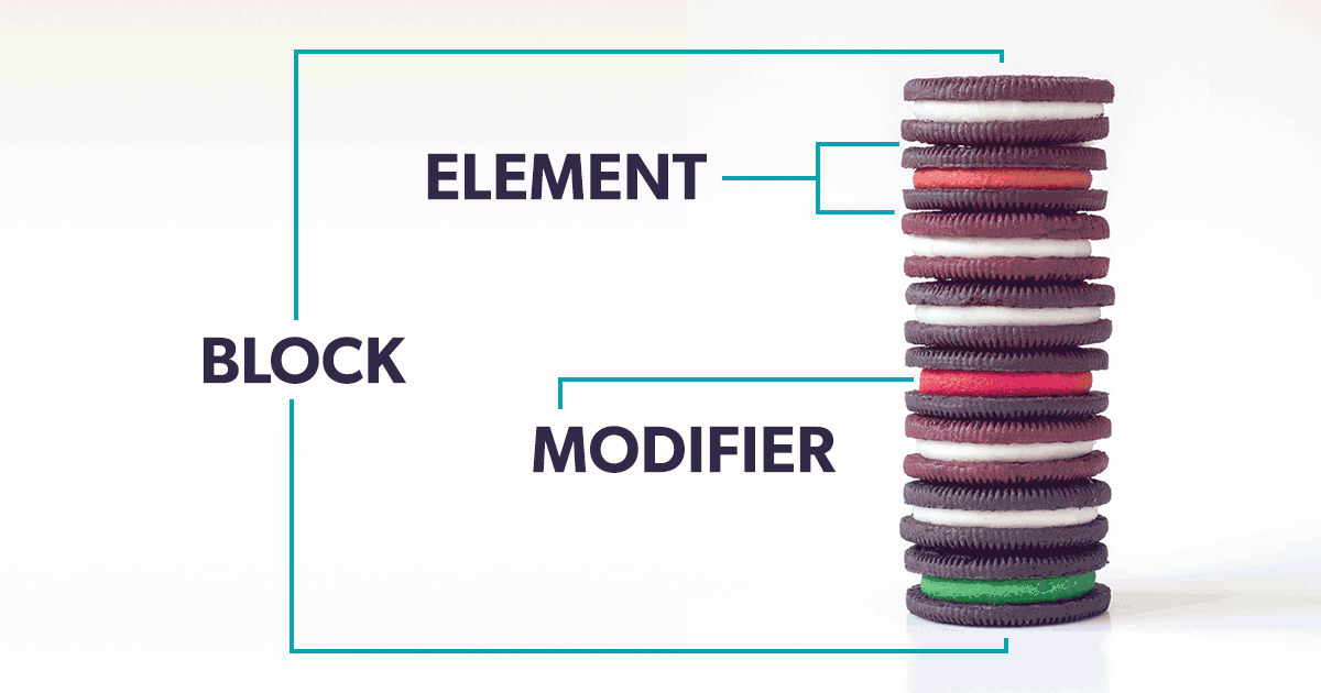
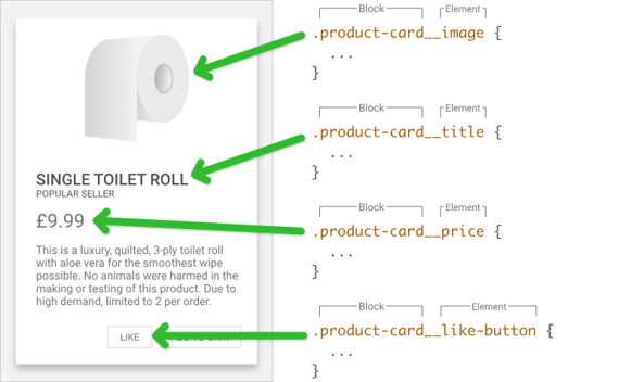
- Block: The standalone entity (e.g.,
menu,button,card) - Element: A part of the block that performs a specific function (e.g.,
menu__item,card__title) - Modifier: A flag on a block or element to change appearance or behavior (e.g.,
button--primary,card--featured)
Benefits of BEM
- Predictable, readable class names
- Avoids selector conflicts and deep nesting
- Makes team collaboration easier on large projects
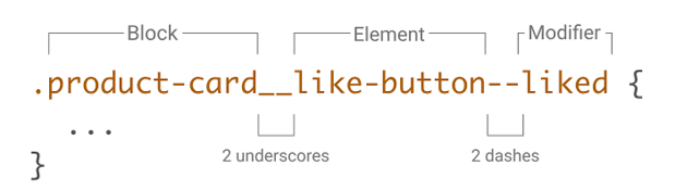
Example:
.card { }
.card__title { }
.card--featured { }
What “Mobile First” Means
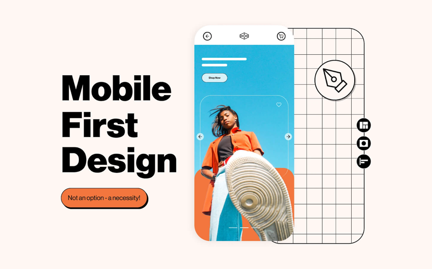
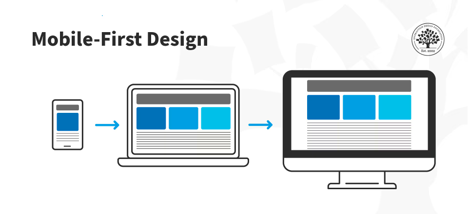
Mobile-first is a design and development approach where you start building for the smallest screen size (mobile), then progressively enhance the design for larger screens (tablet, desktop).
- Default styles = mobile (small screens).
- Media queries = only for larger breakpoints (not smaller).
- Why? Because most users browse on mobile first, and it forces you to keep layouts simple and lightweight.
Example media queries for Mobile First Design
mediaqueries.css
.button {
  padding: 8px 12px;
  font-size: 16px;
  background-color:#0073e6;
  color:white;

  /*Small devices (landscape phones, 576px and up)*/
  @media (min-width: 600px) {
    padding: 12px 16px;
  }

  /*Medium devices (tablets, 768px and up)*/
  @media (min-width: 744px) {
    font-size: 25px;
  }

  /*Large devices (desktops, 992px and up)*/
  @media (min-width: 1024px) {

  }

  /*Extra large devices (large desktops, 1200px and up)*/
  @media (min-width: 1280px) {

  }

}
Benefits of Mobile-First
- Better performance on mobile devices.
- Simplified CSS with fewer overrides.
- Focus on essential content and features first.
- Easier to maintain and scale styles for multiple screen sizes.
- Aligns with modern user behavior (mobile-first browsing).
- Encourages thoughtful design decisions prioritizing usability on small screens.
- Improved SEO as search engines prioritize mobile-friendly sites.
- Future-proofing as mobile usage continues to grow.
- Enhanced accessibility by focusing on core content and functionality first.
- More efficient use of resources by loading only necessary assets for mobile users.
- Encourages a content-first approach, ensuring that the most important information is presented clearly on smaller screens.
- Facilitates a more streamlined and user-centric design process.
- Leads to a more cohesive and consistent user experience across all devices.
How BEM and Mobile-First Work Together
- Organized Scaling: BEM’s clear block, element, and modifier classes let you easily target specific parts of a component when writing media queries for different breakpoints.
- Isolation of Styles: Since BEM encourages non-nested, flat selectors, it reduces the risk of style conflicts when adding responsive overrides.
- Reusable Patterns: You can start with mobile-friendly, reusable BEM blocks and add modifiers or responsive adjustments as needed for tablets and desktops.
Example: BEM + Mobile-First
.card {
  padding: 12px;
  font-size: 16px;
}

.card--featured {
  background: gold;
}

@media (min-width: 768px) {
  .card {
    padding: 24px;
    font-size: 18px;
  }
  .card--featured {
    background: orange;
  }
}
In this example, .card and .card--featured provide clarity and isolation, while media queries enhance the component for larger screens. This keeps your CSS modular and scalable as your project and target devices grow.
Last updated on