FAQs
Mobile First, How It Works in CSS
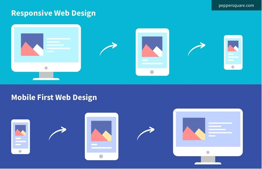
Instead of starting with desktop styles and then overriding them for mobile, you flip it:
mobile-first.css
  // media aliases and breakpoints

  $screen-sm-min: 600px;  // Extra small (mobile) and up

  $screen-md-min: 744px; // Tablet Portrait and up

  $screen-lg-min: 1024px;   // Tablet Landscape and up

  $screen-xl-min: 1280px;
Example Conversion
Desktop-first code:
desktop.css
.card {
  display: flex;
  gap: 2rem;
}

/* Adjust for mobile */
@media (max-width: 600px) {
  .card {
    display: block;
    gap: 1rem;
  }
}
Converted to mobile-first:
mobile.css
.card {
  display: flex;
  gap: 2rem;

  /* Adjust for mobile */
  @include sm{
    display: block;
    gap: 1rem;
  }
}
How to Convert a Desktop-First Site into Mobile-First
Start from your base CSS:
Remove all “desktop” assumptions as defaults. Write default styles for mobile (single column, smaller paddings, stacked layouts).
Flip your media queries:
Replace @media (max-width: …) with @media (min-width: …).
Example:
desktop.css
    @media (max-width: 768px) { … }
    → @media (min-width: 768px) { … }
Simplify defaults:
- Typography: smaller font sizes by default.
- Layout: stacked / vertical by default.
- Spacing: tighter margins/paddings by default.
Progressively enhance:
- Add columns, grids, sidebars only when screen is wide enough.
- Use min-width breakpoints to scale up.
Javascript using Min width media queries to enhance the experience for larger screens.
const mq = window.matchMedia('(min-width: 800px)');

function handleWidthChange(e) {
  if (e.matches) {
    // The viewport is at least 800px wide
    console.log('Viewport is 800px or wider');
  } else {
    // The viewport is less than 800px wide
    console.log('Viewport is less than 800px');
  }
}

// Listen for changes
mq.addEventListener('change', handleWidthChange);

// Initial check
handleWidthChange(mq);
for more info https://developer.mozilla.org/en-US/docs/Web/API/Window/matchMedia
How do BEM and mobile-first work together
- BEM and mobile-first complement each other by providing a structured approach to naming CSS classes while ensuring styles are optimized for mobile devices first, then enhanced for larger screens using media queries.
Sample code
.card {
  padding: 12px;
  font-size: 16px;
}
.card--featured {
  background: gold;
}
Last updated on